* cyrilla 🦣
@sybilla121🤍🤍 ——⟡. シリラ 🪳 20 he/she 🪳 “artist” 🪳 16+ only please … find me on bsky if you can LOL ໒꒱.️꙳⋆
Similar User

@kkamcho_UTAU

@liure_info

@hhappd2

@lanvanem

@GalacticNightz

@pjo5G

@chevieri

@nicrinu

@gnloop

@_DOS_SIN_

@InsomniKyo

@KMnO4_utau

@chestilll

@utau_yonaka

@tkn7386
A twisted OC map for my twisted OCs. Do you like them

Hi, I'm Enrico and I hate Vtubers. Catch me on Twitch being really annoying, or on YouTube being really disgusting. ‣ twitch.tv/enrico ‣ youtube.com/EnricoZenitani ‣ thingsinmyass.org 🎨#FanricoArtitani

In November 1999, Eric Jordan, Tony Novak, and John Carrol founded a digital creative agency called 2Advanced Studios. The agency was renowned for its innovative, high-end design using Flash technology. 2Advanced Studios v3 flash website in 2001 #WebDesignHistory
i’m so friggin jealous i want them i need them
I can't believe I have every hatoful boyfriend plushie now 😍 NEED TO FIND A COOL WAY TO DISPLAY THEM!

セルフお祝い可愛すぎた

カゼヒキくんお誕生日おめでとうございます! VOCALOIDチームより感謝を込めて カゼヒキVにセルフお祝いソングを歌っていただきました。 今年はEnglish versionでお届けします! Happy Birthday, Kazehiki! We had KazehikiV sing a self-celebration song. This year, we’re delivering in English!…
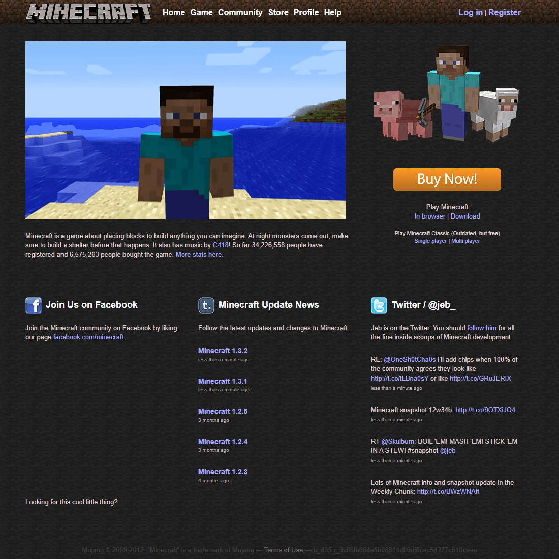
japanese news sites still look like this
my website straight up looks like this
internet explorer is the only thing whose design has actually improved over the years. i believe so. the last few renditions were bright and more cohesive. i didnt like the harsh blacks and densely-packed-together icons in the old toolbars. but fuck IE
THIS IS SO PEAKKKKKKKK i miss habbo i wish the game was good
this was the beginning of the end if im being honest
On October 21, 2010, Microsoft launched Windows Phone 7, a mobile phone whose user interface was created using flat design. The new visual style received positive feedback, and Microsoft used flat design elements in the design of the Windows 8 graphics interface.

this was so elegant and coquette
On October 23, 2001, Apple introduced the first-generation iPod.

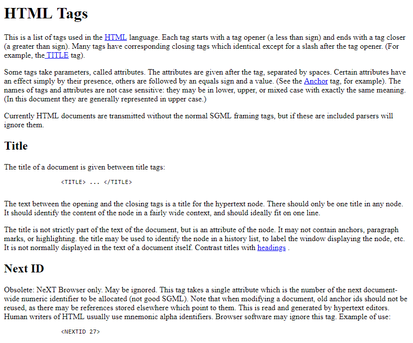
Happy 33rd Birthday HTML tags! On October 29, 1991, the internet pioneer, Tim Berners-Lee, published a document entitled HTML Tags. The document contained a description of the first 18 HTML tags: <title>, <nextid>, <a>, <isindex>, <plaintext>, <listing>, <p>, <h1>…<h6>,…

with the early access release of hatsune miku NT 2.0 available now, here's a throwback to our song which uses NT 1.0! (in which miku is a menace) #初音ミク #初音ミクNT #hatsunemiku
The fact that this gremlin's home-made motion tracking game is smoother and better quality than most Vtuber companies and agency out there is still insane to me
United States Trends
- 1. #TSBlackFridayCollection 2.018 posts
- 2. $DCK N/A
- 3. Thanksgiving 186 B posts
- 4. $CUTO 14 B posts
- 5. Kreider 2.206 posts
- 6. #BBMAs 156 B posts
- 7. Axios 20,3 B posts
- 8. #SonicMovie3 58,5 B posts
- 9. #MondayMotivation 22,2 B posts
- 10. #IDontWantToOverreactBUT 1.272 posts
- 11. $FRED 23,1 B posts
- 12. Trouba 1.660 posts
- 13. Porzingis 3.280 posts
- 14. Phylicia Rashad 2.303 posts
- 15. Outlook 11,1 B posts
- 16. Kemp 4.476 posts
- 17. Rumble 30,9 B posts
- 18. Marshall Law 2.393 posts
- 19. Kikuchi 7.380 posts
- 20. Victory Monday 4.523 posts
Who to follow
-
 🌸깜쵸/カムチョ🌸
@kkamcho_UTAU -
 liure_info
@liure_info -
 곧 계폭할 희번/HB(moved)
@hhappd2 -
 💉 m
💉 m
@lanvanem -
 Galactix
@GalacticNightz -
 pjo
pjo
@pjo5G -
 Vieri
Vieri
@chevieri -
 crin (*´ ˘ `*)♡
@nicrinu -
 Gianloop🍕
@gnloop -
 daws
daws
@_DOS_SIN_ -
 InsomniKyo
@InsomniKyo -
 Naki@MIKU EXPO BERLIN
@KMnO4_utau -
 Chestil
@chestilll -
 夜中entropy
@utau_yonaka -
 ren
ren
@tkn7386
Something went wrong.
Something went wrong.


