appl
@appl_uniqueSpecializing in visual design and software ergonomics. #Android #Windows #iOS #SoftwareDeveloper #FLStudio Also in music composition, sheet notation, production
Similar User

@xanodios

@AstroX809_

@Silentghost_odd

@nanquestz

@JanluOfficial

@highpiner

@Triangten

@stealthymax

@Jovani_Gall

@xoxpmf

@tw_Magnusxd

@eggwardyeet

@MoharGanguly

@The_Real_Hello
This is awesome. These are so good. Buttery smooth, excellent finger speed response. It's so natural and smooth
HyperOS 2.0 Control centre swipe animation along with Notification panel transition animation looks fantastic 🥰 Do you like it ? 👀
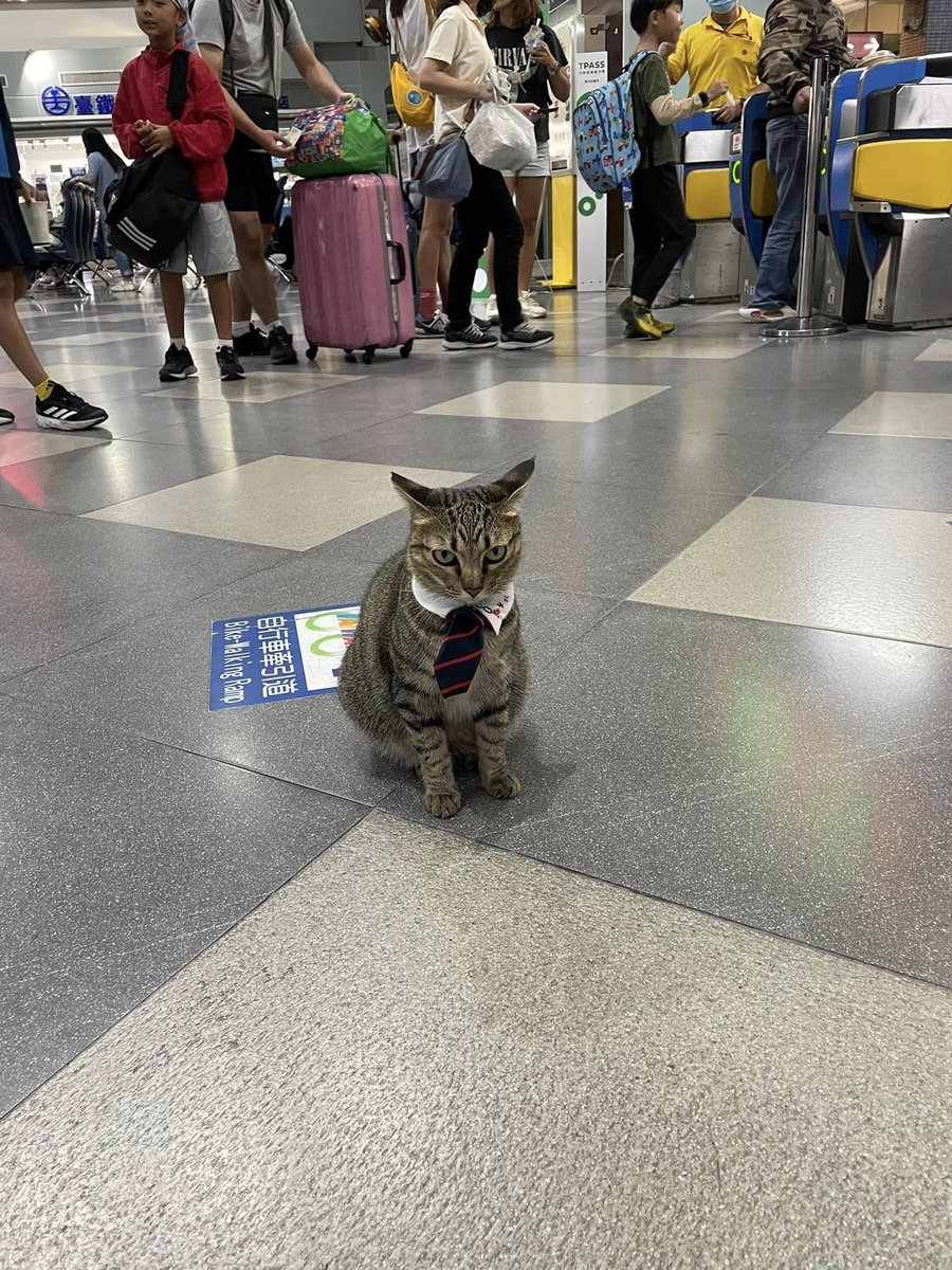
NSFW: Station manager shocks commuters by showing up to work in tie but no trousers.

This needs to be repeatedly addressed. WHAT is samsung doing?
This Control centre animation in HyperOS 2.0 is next level 🥰 And Xiaomi engineers deserves my praise. ⏩️ Before you ask me the question who is overall better in animation and smoothness between HyperOS 2.0 and ColorOS 15 👀 Let me answer ColorOS 15 is better 🔥
me when i find my friends in a comment section

MICROSOFT START rebranding BACK to MSN IS THE GREATEST THING TO HAPPEN—IT WAS LONG OVERDUE!

This level of fluidity is what Samsung should be over. OVER. Not under.
This Control centre animation in HyperOS 2.0 is next level 🥰 And Xiaomi engineers deserves my praise. ⏩️ Before you ask me the question who is overall better in animation and smoothness between HyperOS 2.0 and ColorOS 15 👀 Let me answer ColorOS 15 is better 🔥
It's VERY smooth, I'll give them that. Way better than any other attempt I've seen
These are horrible. They're just doing whatever at this point. Like there's no justification for the random additions, there's not even a change in the actual shapes😭 so why change anything if you're just bored
One UI 7: Redesigned Contact and Phone app icons👀 Repost #OneUI7 #Samsung #GalaxyS24

Blur on folders and quick panel are good. Color saturation effects are really good on folder and quick panel toggles. Smooth corners on pill toggles are superb.
ONE UI 7: Confirmed: There are no improvements to One UI Home animations. Claim: One UI HOME animations have been improved Verdict: ❌️False Notable observations: No improvements to: -Open/Close app -App drawer open/close -Recent apps Addition: -Live background blur #Samsung
"if you hate elon so much then why are you still here" BECAUSE I WAS HERE FIRST. WHY SHOULD I LEAVE. HE'S THE ONE WHO SUCKS
well yeah there'll be weather tomorrow

United States Trends
- 1. $CATEX N/A
- 2. $CUTO 7.510 posts
- 3. #collegegameday 2.554 posts
- 4. $XDC 1.424 posts
- 5. #Caturday 7.904 posts
- 6. DeFi 106 B posts
- 7. Henry Silver N/A
- 8. Jayce 83,2 B posts
- 9. #saturdaymorning 3.146 posts
- 10. Good Saturday 2.140 posts
- 11. #Arcane 306 B posts
- 12. #MSIxSTALKER2 6.158 posts
- 13. Renji 3.950 posts
- 14. Senior Day 2.965 posts
- 15. Pence 85,9 B posts
- 16. Cavuto N/A
- 17. Fritz 8.970 posts
- 18. Clyburn 1.125 posts
- 19. Fishers N/A
- 20. Zverev 7.203 posts
Who to follow
-
 Xanodios
@xanodios -
 AstroX809
@AstroX809_ -
 Coughing
@Silentghost_odd -
 nanquest.bsky.social
@nanquestz -
 Janlu
Janlu
@JanluOfficial -
 Tung Huynh
@highpiner -
 Triang10
@Triangten -
 maksimovich
@stealthymax -
 Jovani Gallegos
@Jovani_Gall -
 UXO 🦋
UXO 🦋
@xoxpmf -
 Magnusxd
@tw_Magnusxd -
 real⸜⁄
@eggwardyeet -
 maimoharhoon
@MoharGanguly -
 Hello 🏳️⚧️💙
@The_Real_Hello
Something went wrong.
Something went wrong.


