Lucian Radu
@LucianUnomAward Winning Logo & Brand Identity Designer, Founder & Art Director at UNOM.
Geometric designs in logo crafting aren't just about shapes; they're about storytelling. Each element contributes to a brand narrative, turning a logo into a visual chapter in the brand's journey. #BrandDesign #CleanGeometry #LogoDesign #Logo #Geometry
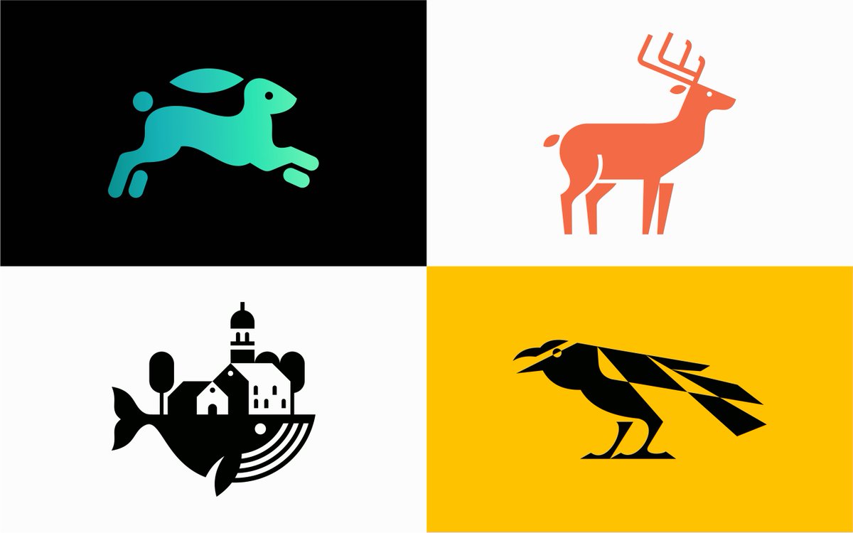
Check out these four new additions to my "Dreamy Curves" collection! Featuring elegant and flowing designs that capture the essence of their subjects with smooth, dreamlike curves. Let me know which one catches your eye! #LogoDesign #DreamyCurves #LogoDesign #Logo #Curves

Trends may fade, but geometric logos remain a design classic. Their enduring appeal ensures that brands stand the test of time with a visual identity that's both timeless and contemporary. #BrandDesign #CleanGeometry #LogoDesign #Logo #Geometry
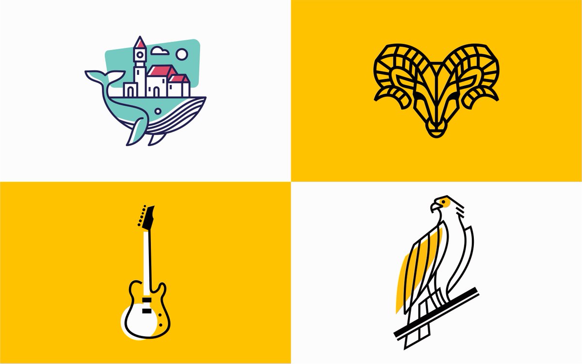
Explore another entries in my "See between the lines" collection! These four designs blend simplicity and depth, featuring a town-bearing whale, a stylized ram, a minimalist guitar, and an elegant eagle. Which one stands out to you? #BrandDesign #LogoDesign #Logo #lineart
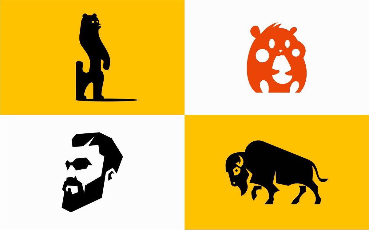
Check out these four new additions to my "Clean Geometry" collection! Featuring bold and minimalistic designs inspired by nature and motion. Let me know which one catches your eye! #BrandDesign #CleanGeometry #LogoDesign #Logo #Geometry
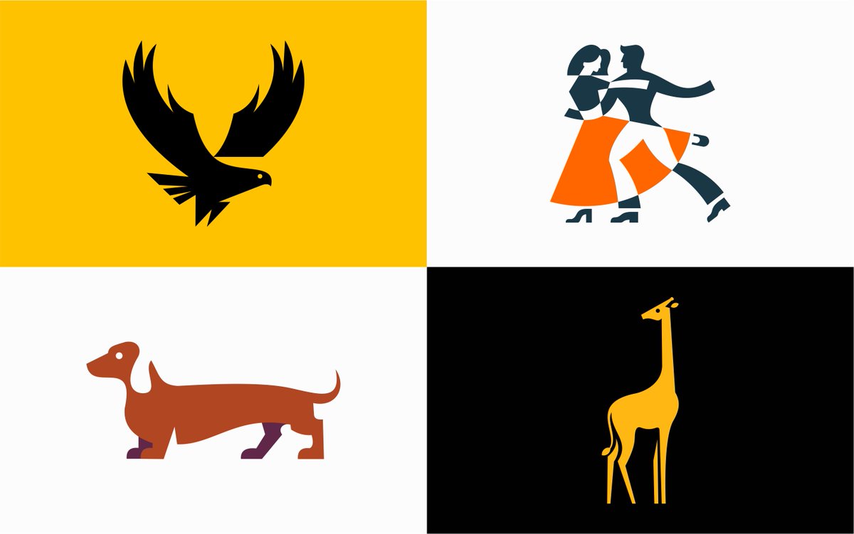
In logo design, harmonized curves bring a visual balance, offering an aesthetic appeal. Well-blended organic shapes make logos stand out and remain impactful. #LogoDesign #DreamyCurves #LogoDesign #Logo #Curves
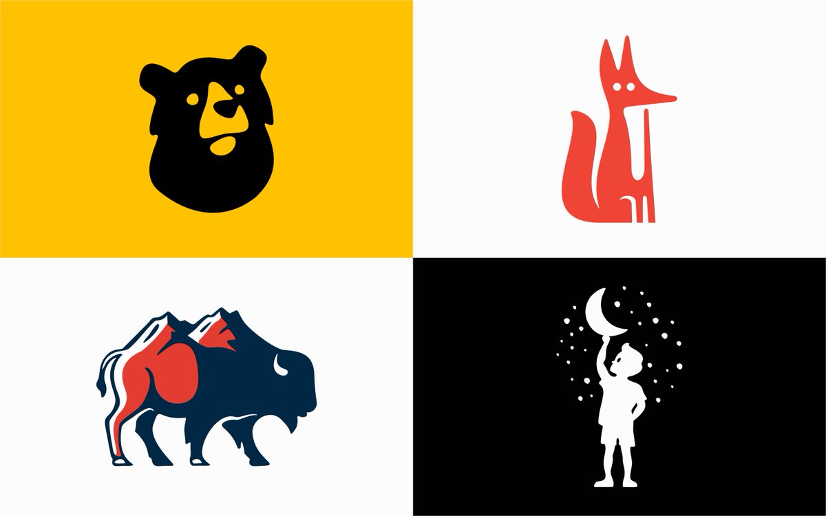
Geometric logos are design chameleons, effortlessly adapting to various sizes and mediums. From business cards to gigantic billboards, they maintain their sleek allure. #BrandDesign #CleanGeometry #LogoDesign #Logo #Geometry

Symmetry in logo design isn't just about looks—it's a strategic move. It's all about showing stability and order, which builds trust and credibility for a brand. And trust me, it leaves a real impression on the audience. #BrandDesign #Symmetry #Logo #LogoDesign

Curves in logo design tap into human psychology, conveying approachability and friendliness. This understanding helps designers forge authentic connections, making brands more relatable and appealing to audiences. #LogoDesign #DreamyCurves #LogoDesign #Logo #Curves

Understanding the principles of geometry in logo design empowers designers to make intentional choices. Whether simplifying complex shapes or creating patterns, this enhances a designer's ability to craft impactful and enduring logos. #BrandDesign #LogoDesign #Logo #Geometry

Line art in logo design offers a minimalist aesthetic that conveys sophistication and elegance. The simplicity of clean lines allows for a timeless and versatile visual identity that resonates with modern audiences. #BrandDesign #LogoDesign #Logo #lineart

Shapes in logo design are essential for visual balance. Circles symbolize unity, squares represent stability, and triangles bring dynamism. This understanding helps designers create logos that align perfectly with brand identities. #BrandDesign #LogoDesign #Logo #Geometry

Asymmetric designs may grab attention, but symmetrical logos often possess a subconscious magnetism. Viewers find comfort in the predictability of mirrored elements, fostering a sense of familiarity and connection with the brand. #BrandDesign #Symmetry #Logo #LogoDesign

The interplay of negative space in geometric logos reveals a design's hidden poetry. Skillful use of the spaces between shapes crafts subtle messages or unveils hidden images, adding layers of intrigue. #BrandDesign #CleanGeometry #LogoDesign #Logo #Geometry

Brands can use curved logos to signal a departure from traditional norms. Embracing unconventional shapes and curves challenges industry expectations, positioning the brand as innovative and forward-thinking. #LogoDesign #DreamyCurves #LogoDesign #Logo #Curves

The adaptability of geometric logos across screens and print materials is their superpower. From smartphones to billboards, these designs maintain a sleek and consistent appearance, amplifying brand recognition. #BrandDesign #CleanGeometry #LogoDesign #Logo #Geometry

Mastering the art of curve placement involves considering negative space. Utilizing the voids around curves strategically enhances the overall composition, ensuring that every element contributes to a cohesive and impactful logo. #LogoDesign #DreamyCurves #LogoDesign #Logo

The evolution of logo design reflects changing design trends. While trends come and go, the timeless appeal of geometric logos endures, making them a reliable choice for brands seeking enduring visual identities. #BrandDesign #CleanGeometry #LogoDesign #Logo #Geometry

Symmetry in logo design serves as a timeless principle, offering a visual equilibrium that resonates with the human eye. Balanced compositions, where elements mirror each other, create a harmonious and memorable brand identity. #BrandDesign #SymmetricalBalance #Logo #LogoDesign

Part 3 of Wordmarks I've designed in the past years! Opent to Projects → hi@mihai.design #daretoshare24


This week's last design post! 4 more Wordmarks, I've designed in the past years! Opent to Projects → hi@mihai.design #daretoshare24


United States Trends
- 1. $CATEX N/A
- 2. $CUTO 7.510 posts
- 3. #collegegameday 2.631 posts
- 4. $XDC 1.435 posts
- 5. #Caturday 7.932 posts
- 6. DeFi 106 B posts
- 7. Henry Silver N/A
- 8. Jayce 84,5 B posts
- 9. #saturdaymorning 3.163 posts
- 10. #Arcane 24,9 B posts
- 11. Good Saturday 37 B posts
- 12. Renji 4.009 posts
- 13. #MSIxSTALKER2 6.158 posts
- 14. Senior Day 2.977 posts
- 15. Pence 86,1 B posts
- 16. Fritz 9.149 posts
- 17. Cavuto N/A
- 18. Clyburn 1.153 posts
- 19. Zverev 7.266 posts
- 20. McCormick-Casey 28,8 B posts
Something went wrong.
Something went wrong.


